

In today’s tech-driven world, smartphones are more than just devices—they’re integral to how people live, work, and shop. For e-commerce websites, mobile responsiveness has become a cornerstone of success. As more consumers turn to their phones for purchases, overlooking mobile optimization can spell disaster for businesses. Let’s dive into why mobile responsiveness is essential for e-commerce platforms and how it shapes user satisfaction, sales performance, and long-term growth.
1. The Rise of Mobile Shopping
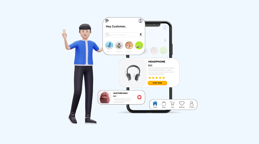
Mobile shopping is no longer a trend—it’s a dominant force. Projections estimate that by 2025, mobile transactions could make up a significant chunk of e-commerce revenue, driven by the ease and immediacy smartphones offer. With billions relying on these devices daily, companies that don’t prioritize mobile users risk alienating a massive audience, leaving potential sales on the table.
2. Elevating User Experience (UX)
A mobile-responsive site adjusts effortlessly to any screen size, delivering a fluid and pleasant shopping journey. Key components of a stellar UX include:
- Smooth Navigation: Clear menus and clickable options make browsing intuitive.
- Quick Loading: Speed is critical—delays can push users away and spike bounce rates.
- Clear Text: Content should be easy to read without pinching or scrolling sideways.
- Touch Optimization: Buttons and links need to work flawlessly with fingertips, not just cursors.
When UX shines, shoppers stick around longer, abandon carts less often, and leave happier—boosting loyalty and engagement.
3. Boosting Sales Conversions
Mobile-friendly websites turn browsers into buyers more effectively. Research highlights that even a brief lag in page loading can dent conversion rates significantly. A responsive design ensures seamless browsing, cart additions, and checkouts. Add features like instant checkout, digital wallets, or autofill, and the path to purchase becomes even smoother, driving up sales.
4. SEO Benefits
Search engines like Google now judge sites based on their mobile versions first. A responsive design offers:
- Improved Rankings: Mobile-friendly sites climb higher in search results.
- Reduced Bounce: Users stay longer when the experience fits their device.
Neglecting this can sink visibility, slash traffic, and hand opportunities to competitors.
5. Standing Out in a Crowded Market
With countless e-commerce players vying for attention, a mobile-optimized site is a differentiator. Brands that embrace responsiveness:
- Draw in and keep more shoppers.
- Build a forward-thinking, customer-first image.
Those lagging behind risk losing ground to rivals who deliver superior mobile experiences.
6. Preparing for Tomorrow’s Tech
Mobile shopping is evolving, with innovations like:
- Voice Commands: Shoppers using assistants like Siri or Alexa expect compatibility.
- Web Apps (PWAs): These blend app-like features with browser accessibility.
A responsive foundation ensures businesses can adopt these advancements without a hitch, staying ahead of the curve.
Conclusion
Mobile responsiveness isn’t a luxury-it’s a must-have for e-commerce survival. It enhances how users interact with your site, lifts conversion rates, strengthens search visibility, and keeps you competitive. In a digital landscape that’s always shifting, businesses that act now to optimize for mobile will thrive. If your e-commerce platform isn’t mobile-ready, the clock is ticking-make the move today!


Leave a Reply